Let's start with Spotify, by having a look at a couple of videos where we can see first of all the presentation of the new design, and second the one of the previous design:
As you can see the new design is more vivid, more interactive and most important more user responsive, and a good part of the blame for this is the addition of more and very carefully designed icons.
In the next picture we are going to see the designs that were thought for a few sections of the application, those are the icons for Album, Artist, Collection (which then became your Music), Discover, Playlist, Profile and Radio:

One of the challenges they had was was representing something that doesn't have physical form, Spotify's music library is immense and yet doesn't have any appearance as such. An early idea they came across was using an iconic album cover, PinkFloyd's Dark Side of the Moon:

Although the resultant icon looks really good, it wasn't finally chosen and that is in my opinion because unfortunately, not everybody knows this album, and then one of the most important rules for icons, be easily recognized by everybody, is not fulfilled.
The next step they followed was the 'Genre' icons, in the next image we can see what I think it is a really smart set of icons, where a background image, an icon and finally the name, make a perfect combination for an easy and fast recognition, We can also see that for specific genres of music they have used the most representative instrument and for others not that much specific, they have explored a little bit more, for example in the chill genre, but it is still really easy to identify and the background image suits perfect.


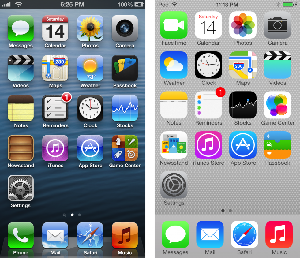
Now let's move to the next part, and we will start by comparing a few identical screenshots of iOS 6, on your left, and iOS 7, on your right:
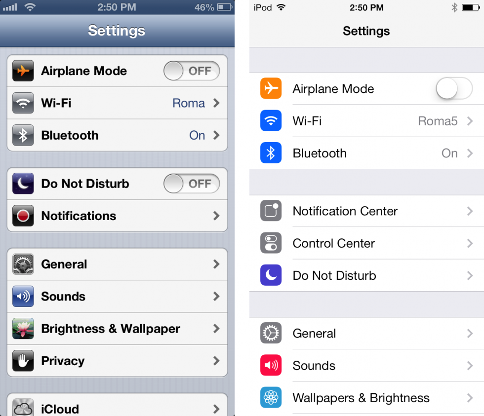

As you can see, Apple have done what some people call the death to textures, and shows one of the most important changes that icons have suffered in the past few years, where designs are now plain and more simpler instead of having depth and color degradation. That I think shows that as we use icons more and more, it's not necessary anymore to make icons so predominant and different from other objects from the UI, because people is more used to them and they can recognize icons easily.
And finally in the next image, we can see the step backwards that Apple made in iOS 7.1, due to people claiming that they took thinks too far, and Apple finally added in the settings screen the possibility to put a bit of texture to the buttons. In the next picture this setting is enabled, and you can compare the button with the ones in the previous picture, and see that it kind of stays in between the iOS 6 and iOS 7 button design:

For further information and the webpages I've used:
http://hicksdesign.co.uk/journal/spotify
http://arstechnica.com/apple/2013/09/death-to-textures-ios-6-and-ios-7-compared-in-pictures/#image-1
https://www.youtube.com/user/spotify